
Fundamental Chart Tutorial
The fundamental chart plots financial data over time. Revenue, profit margins, PE ratios, free cash flow, analyst forecasts and a few hundred other indicators.
You can plot many data points for a single company or several companies side by side.
It's the tool to reach for when you have a question like: is revenue growth speeding up or slowing down? Has the PE ratio ever been this high before? Which of these two companies turns more of its sales into actual profit?
This tutorial goes through the whole tool from the ground up. Nothing here requires a paid account, though a few extras are part of Stock Analysis Pro and are marked as such along the way.
On this page
- Overview
- Make your first chart
- Compare companies
- Swap tickers, keep your setup
- Target one company
- Annual, quarterly and TTM
- Time ranges
- Fine-tune each series
- Chart types
- Values vs. growth
- Add the latest value
- Hide or remove a series
- Split the chart into panels
- Percent change mode
- Mixed currencies
- Labels and grid lines
- Forecasts and analyst data
- Download the chart
- Share a chart
- Saved charts
- A few finishing tips
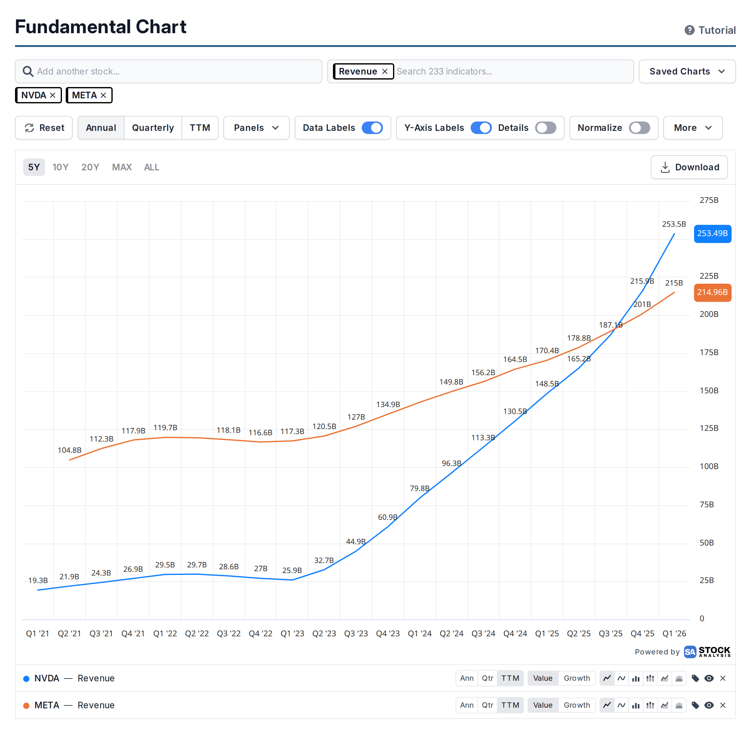
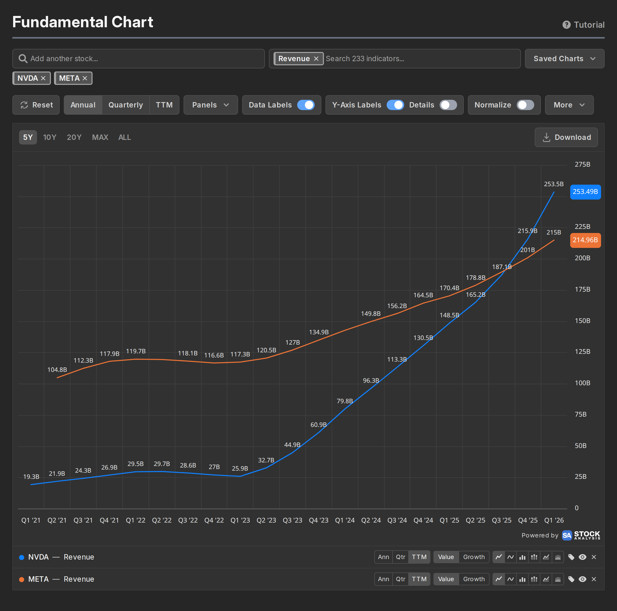
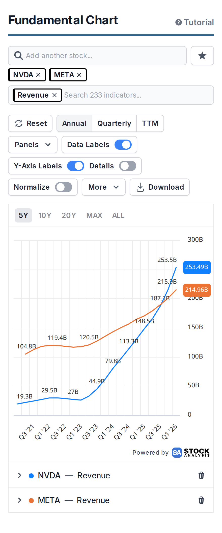
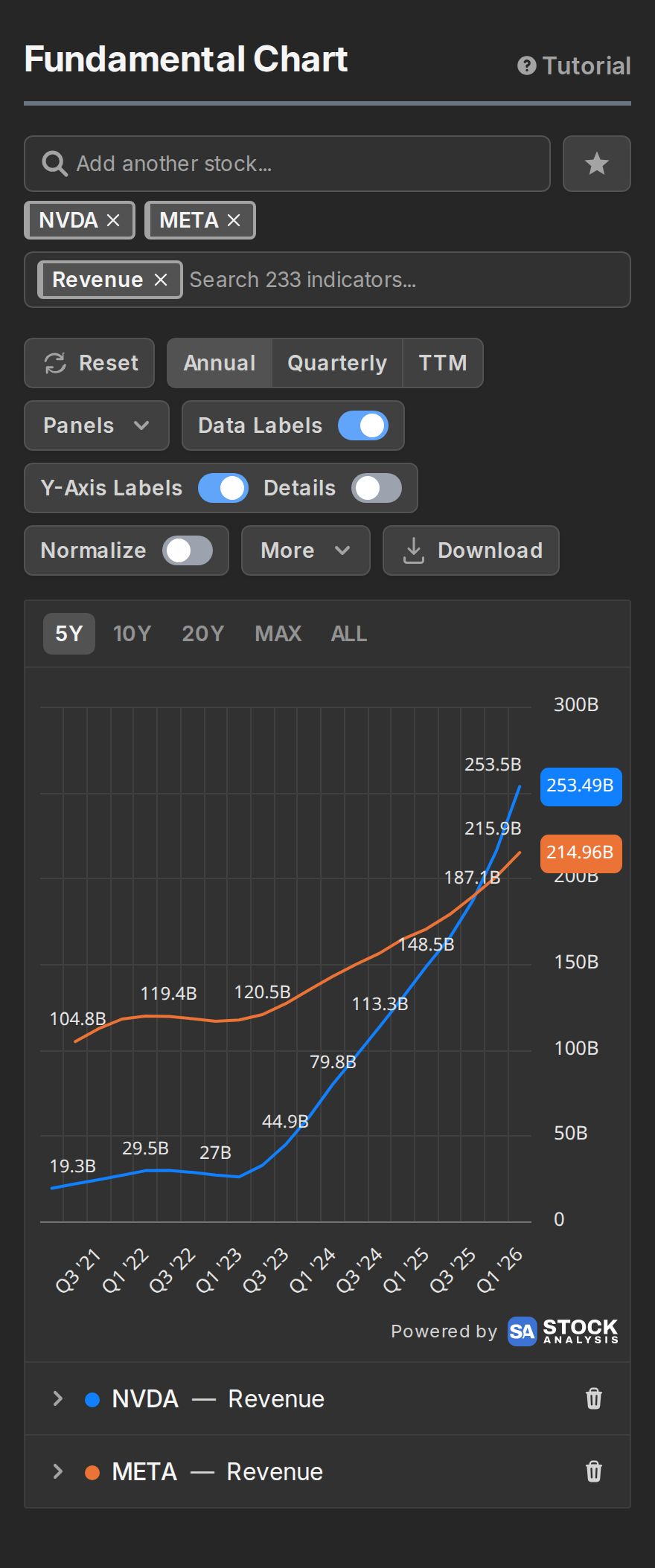
Here's the layout in a nutshell. The two search boxes at the top are where you pick companies and indicators, and your picks stay visible as small pills in and under the boxes. The row of controls under them applies to the chart as a whole. Time ranges sit in the top corner of the chart itself. And every plotted line gets its own row below the chart, with controls that affect just that one series.
If you'd rather poke at the tool first and read later, open the chart and click one of the preset chart buttons on the empty page. This tutorial will still be here.
Make your first chart
Start by typing a company name or ticker symbol into the search box. Results appear as you type, and the search matches both company name and stock symbol ("nvidia" and "NVDA" both match).
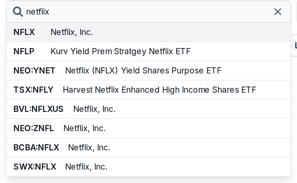
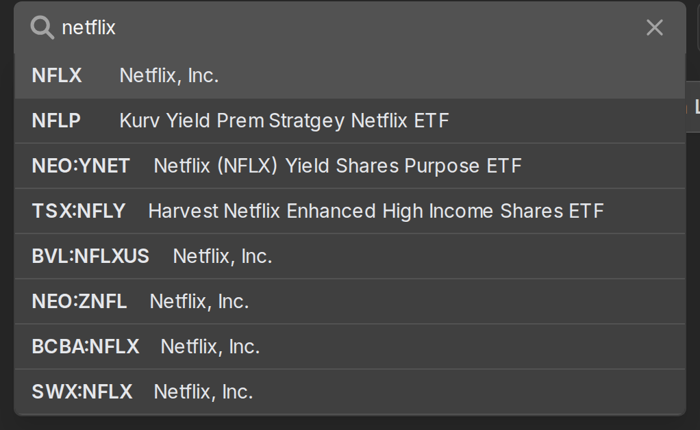
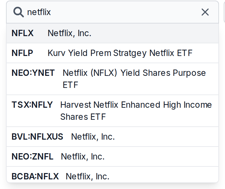
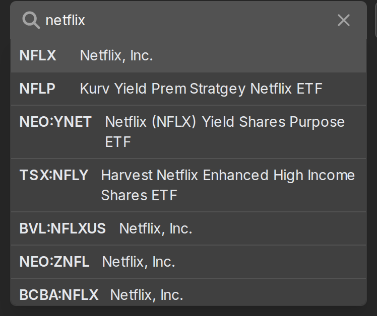
Pick a company and it turns into a small pill inside the box. A second search box next to the first one lights upappears below it, this time for indicators. ClickTap it and you get the full list.
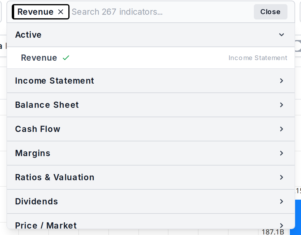
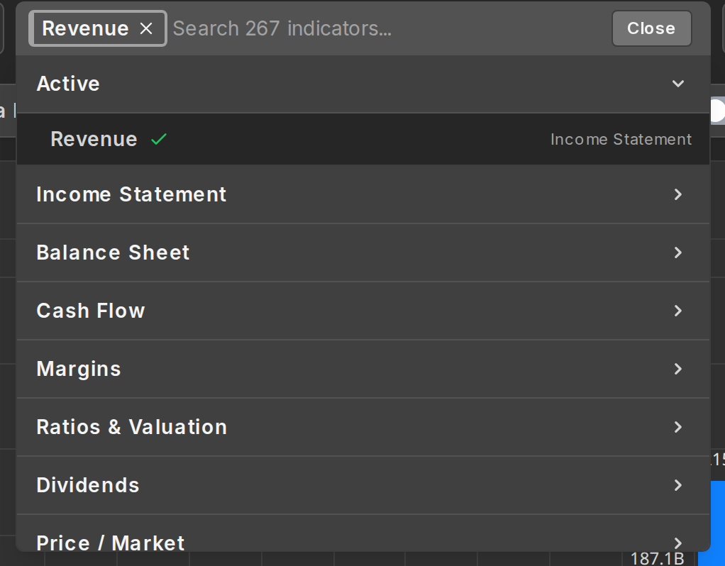
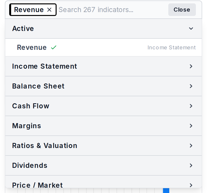
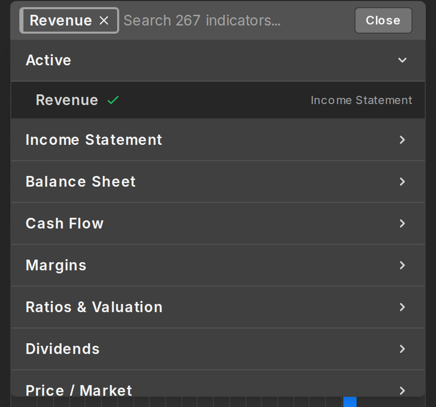
You can scroll the list and toggle the categories to see all the available indicators, but typing is much faster and easier.
The search understands everyday names for things, so "net margin" finds Profit Margin and "sales" finds Revenue.
Click an indicator and it lands on the chart. That's the main way to use the fundamental chart: pick one or several companies, pick indicators, read the chart.
Two small things worth knowing early. The Active group at the top of the indicator list shows what's currently plotted, and clicking an indicator there takes it off the chart again. And the list only offers indicators that exist for the company you picked, so you won't find options like Inventory Turnover on a bank stock.
Compare companies
Add a second ticker to the stock box and the chart mirrors your indicators to it. If you had revenue plotted for Apple and you add Microsoft, you get Microsoft's revenue too, drawn in its own color.
This works in both directions: remove a company and its lines go away, remove an indicator and it disappears for every company at once.
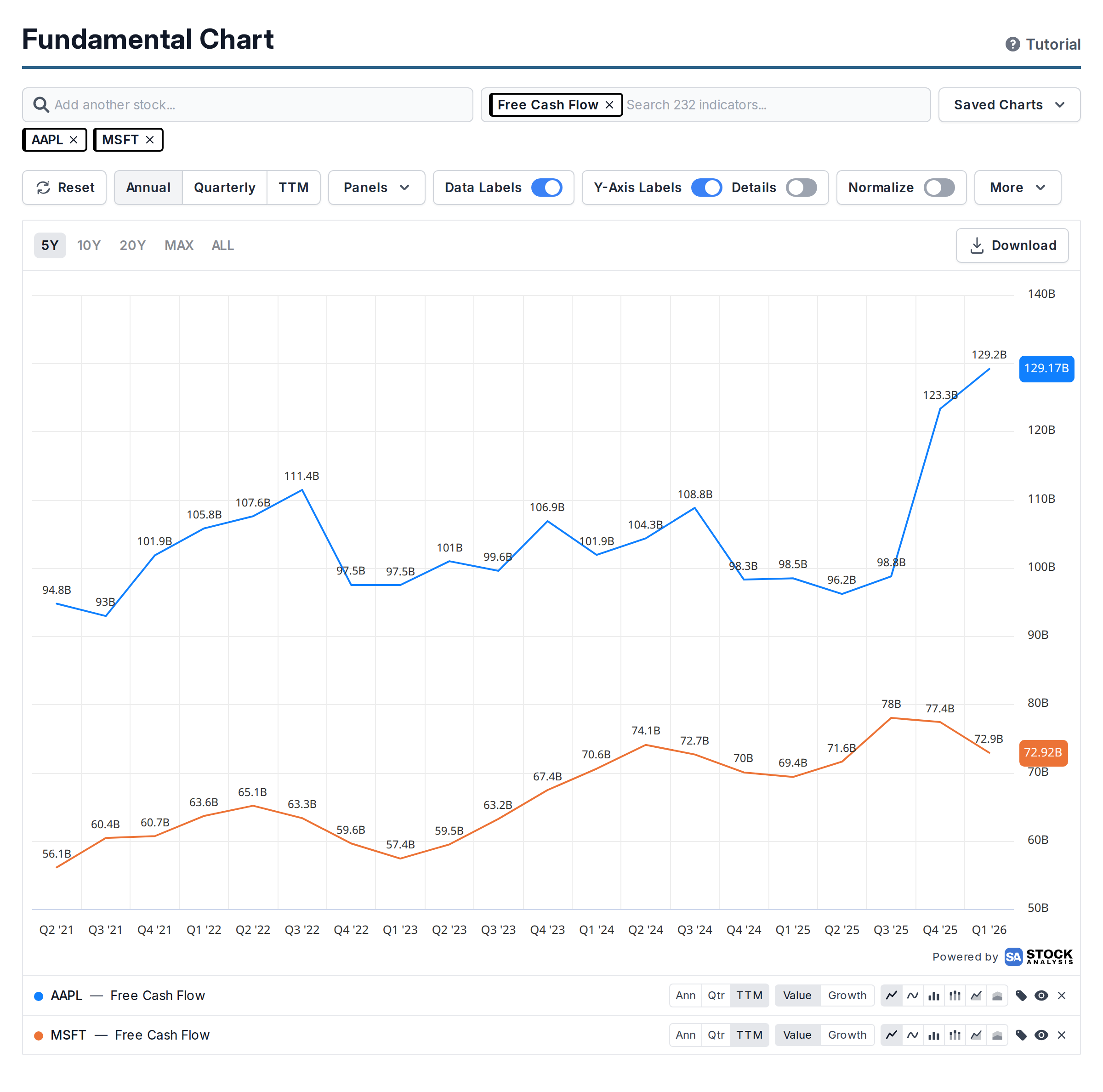
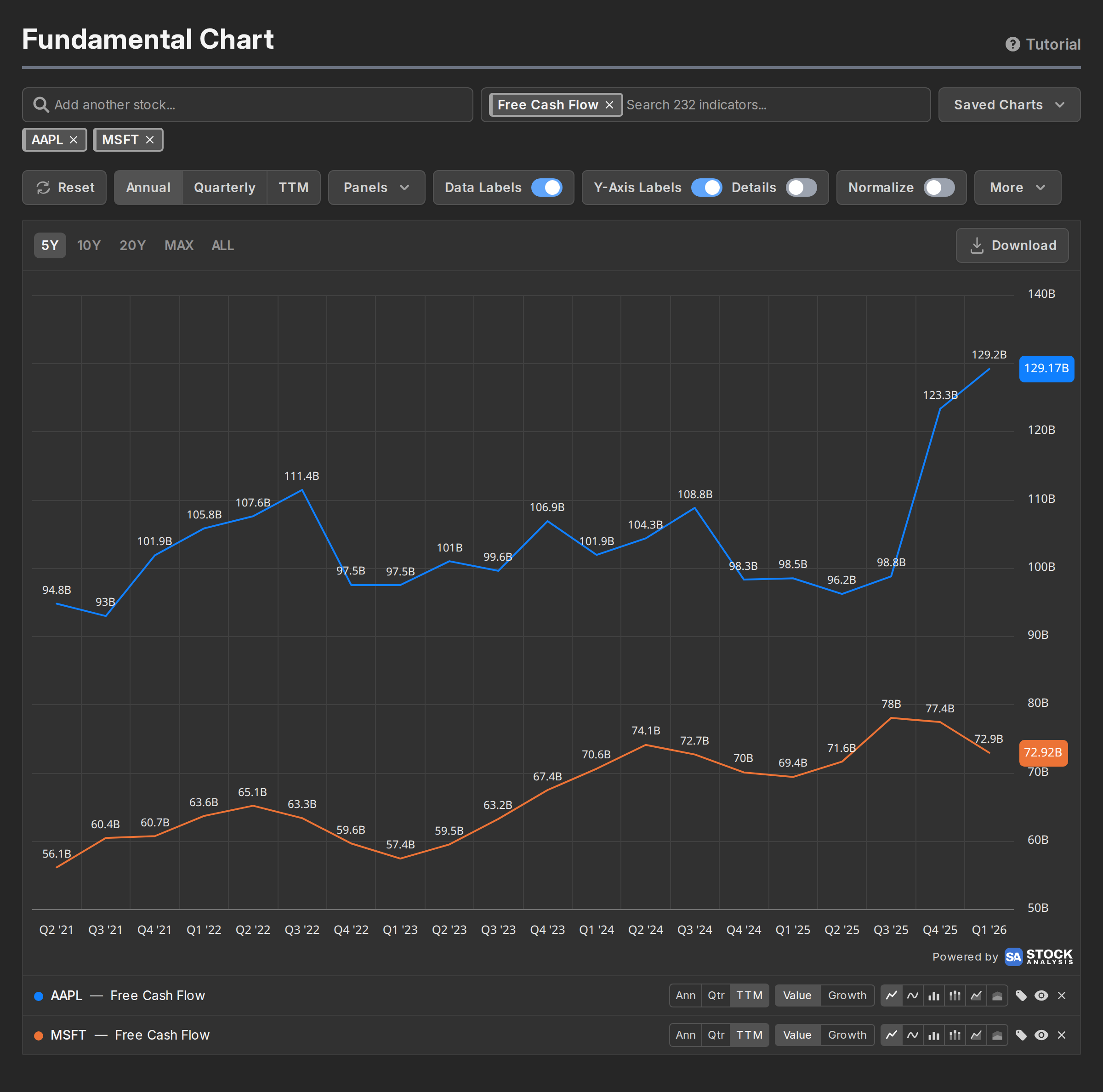
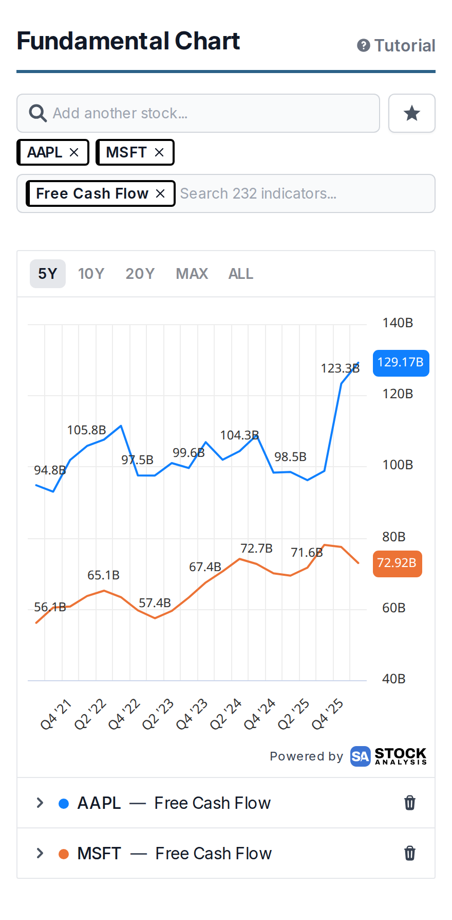
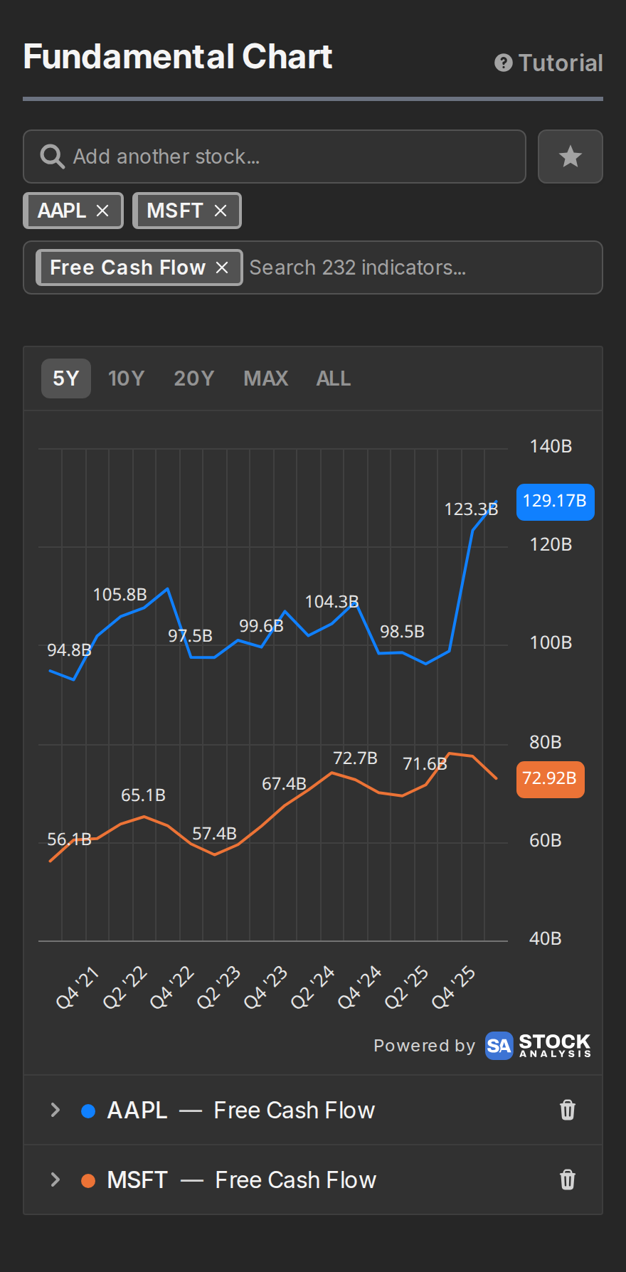
With more than one company selected, the indicator list narrows to what's available for all of them. If an indicator you expected seems to be missing, that's usually why.
Swap tickers, keep your setup
Every company and indicator you pick shows up as a small pill. A single pill sits inside its search box; pick a second one and they move to a row below it.



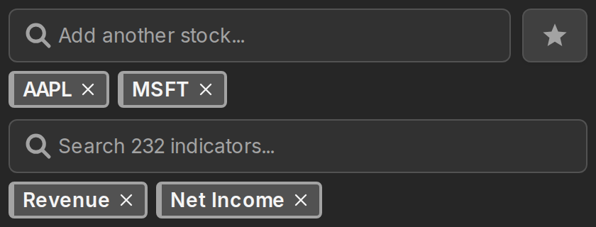
The x on a pill removes it. Removing an indicator pill takes its lines off the chart for every company. Removing a ticker pill takes that company's lines too, but here's the useful part: the indicator pills stay. They dim, and the moment you add another ticker they re-apply to it, with the same time range, chart type and value/growth choice you had.


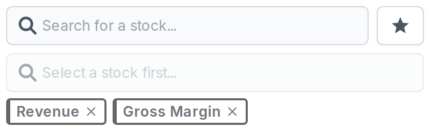
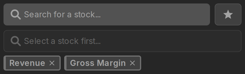
So swapping companies never means rebuilding the chart. Set up revenue, net income and gross margin for NVIDIA, remove NVDA, add AMD, and you get the same three series for AMD.
The Reset button clears everything, pills included.
Target one company
By default an indicator pick applies to every selected company. Sometimes you don't want that. Say Apple and Microsoft are both plotted and you want Apple's research spending on the chart without Microsoft's.
ClickTap the ticker on a pill (the symbol itself, not the x) and it gets a blue ring. While it's targeted, the indicator search lists everything available for that company alone, and picks land only on it. ClickTap the pill again to untarget it.


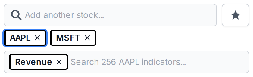
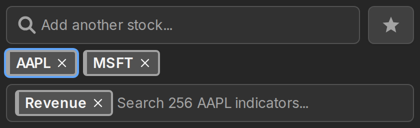
Series added this way are one-offs: they don't create an indicator pill, and they stay on the chart even if you remove their ticker later. You manage them from their rows below the chart. Company-specific series from the Metrics & KPIs category, like segment revenue, work the same way.
It works in the other direction too. ClickTap an indicator pill and the next company you add gets only the targeted indicators instead of all of them. That one is a one-time thing: adding the ticker uses it up.
Annual, quarterly and TTM
The Annual / Quarterly / TTM switch in the controls bar sets the default period for indicators you add from that point on. Annual gives you one point per fiscal year, Quarterly one per quarter.
TTM stands for trailing twelve months: every point is the sum of the four quarters behind it. It updates each quarter like quarterly data does, but without the seasonal highs and lows, which makes it the nicest view for revenue and profit trends.
Companies that report half-yearly, which is common in some countries, show Semi instead of Quarterly.
Time ranges
The buttons in the top left corner of the chart control how far back it looks: 5Y, 10Y, 20Y, MAX and ALL.




MAX and ALL sound like the same thing but aren't, and the difference matters when companies have different amounts of history:
- MAX starts where every plotted series has data, so the lines stay comparable.
- ALL goes back to the oldest point of any series, even if the others start later.
Once you plot something with daily data, like a PE ratio or market cap, shorter ranges appear too: 3M, 6M, YTD, 1Y and 3Y.
On a free account the chart covers the last 5 years, and the longer ranges open an upgrade prompt for Stock Analysis Pro. However, when none of the plotted data goes back further than 5 years, the long ranges gray out entirely, because they would all draw the same chart. The same idea applies one step up: when the history fits inside 10 years, the 20Y button grays out too.
Fine-tune each series
Every series gets a row under the chart. The colored dot matches the line, the ticker links to the company's page, and the rest of the row is controls.
Every series gets a card under the chart. The colored dot matches the line and the ticker links to the company's page. Tap the card and it opens up into labeled sections with all the controls for that series.


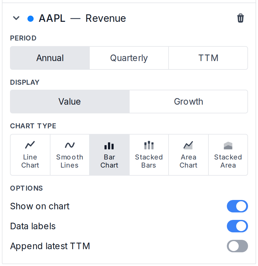
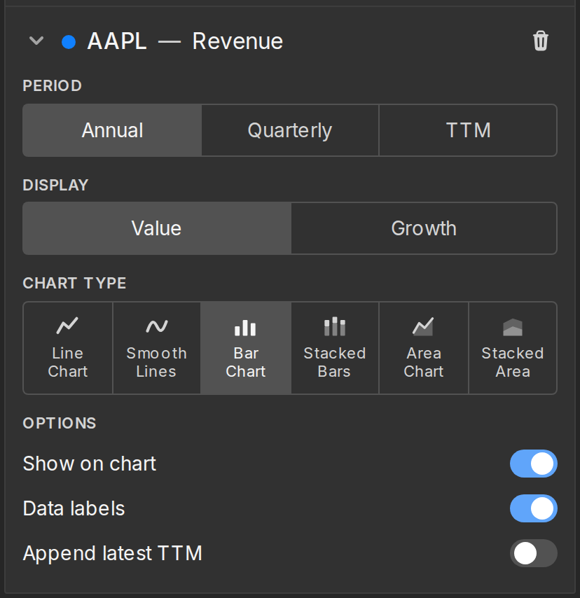
The Ann | Qtr | TTM buttons herePeriod buttons switch the period for this one series only. That's how you put annual revenue next to quarterly margins if that's what you want to see. Indicators with daily history add a DayDaily option.
Chart types
The row of small iconsChart type section switches how the series is drawn: line, smooth line, bars, stacked bars, area, or stacked area. Bars suit yearly financials, lines suit ratios and anything daily. The stacked types are for series that add up to a meaningful total, like revenue segments.
Values vs. growth
Many indicators have a Value / Growth switch. Growth redraws the series as the percentage change against the same period a year earlier, so a quarterly series compares each quarter to the same quarter last year.
Add the latest value
An annual series normally ends at the last completed fiscal year. The +TTM toggle appends one extra point holding the trailing twelve months, so the chart reaches the most recent quarter.
Indicators where a live number exists, like annual or quarterly market cap, say +Current instead and append today's value.
Hide or remove a series
The eye icon hides a series without deleting it, which helps when one big number is making everything else look flat. The x removes it for good.
Split the chart into panels
By default everything shares one chart. The Panels dropdown splits it up: one panel per series, per indicator, per y-axis, or per company.
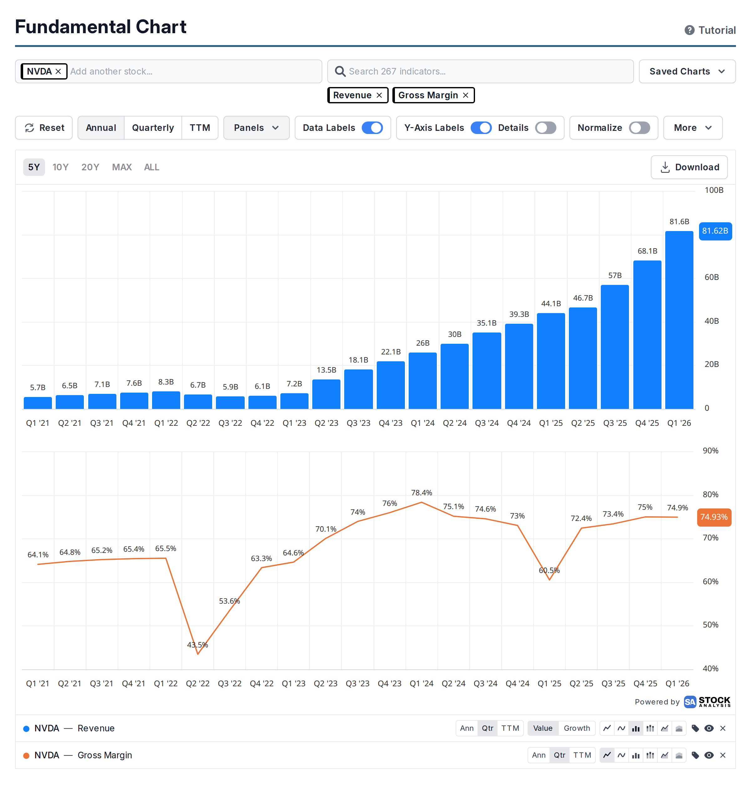
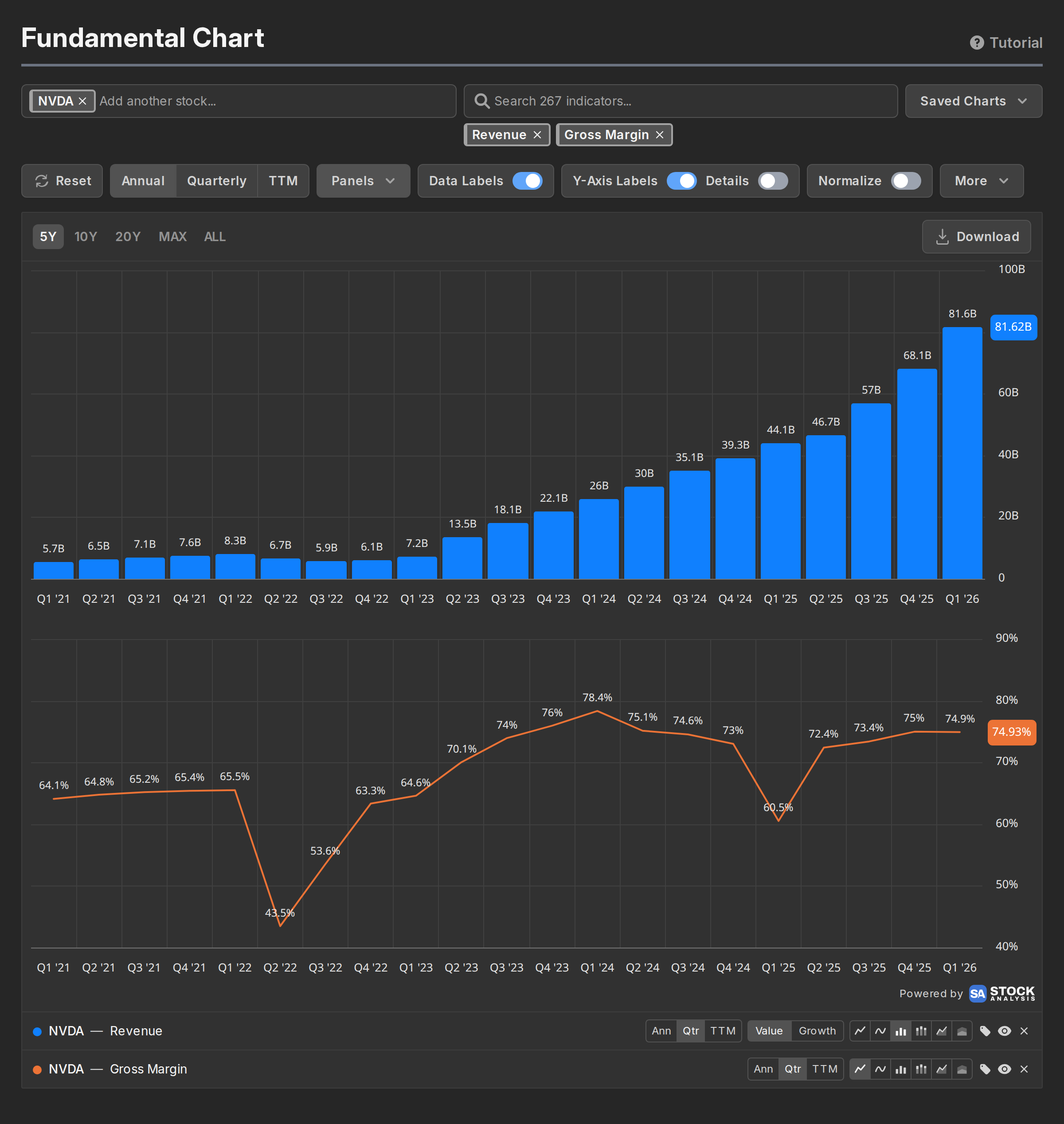
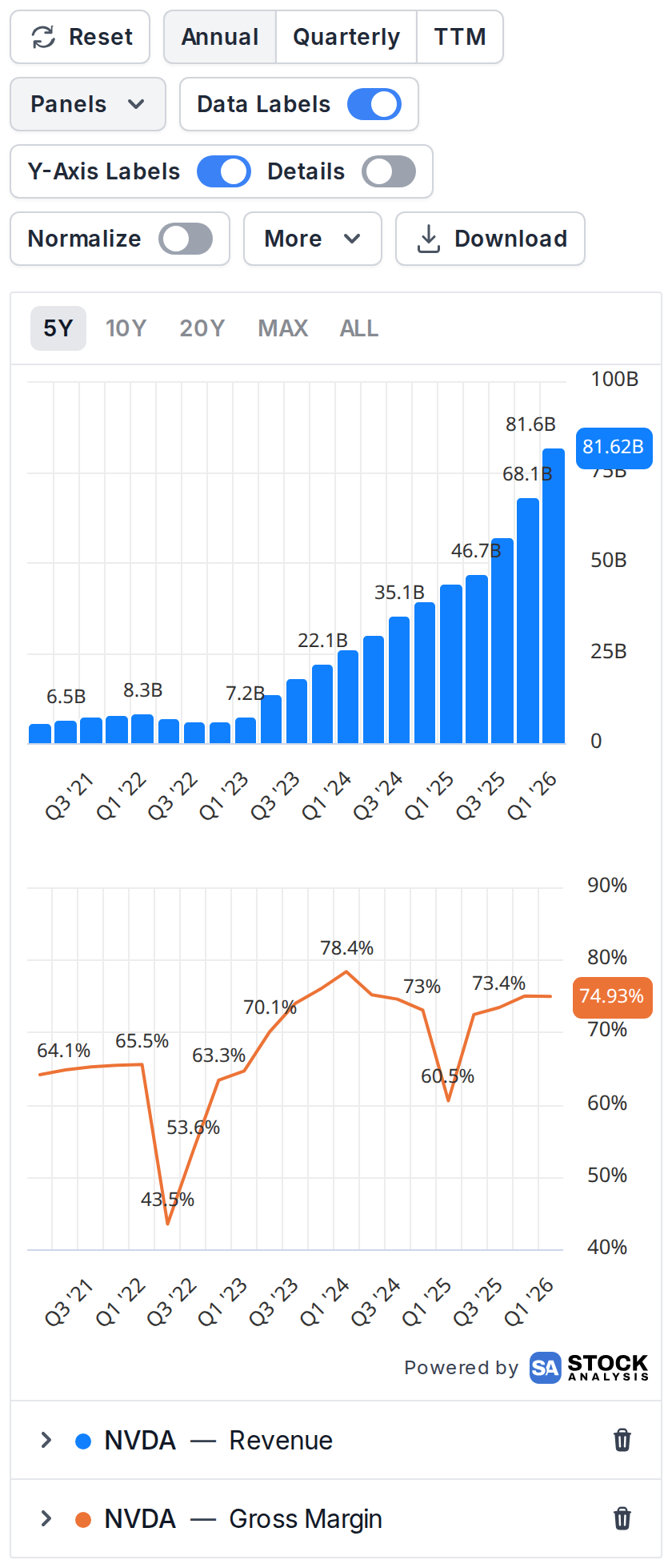
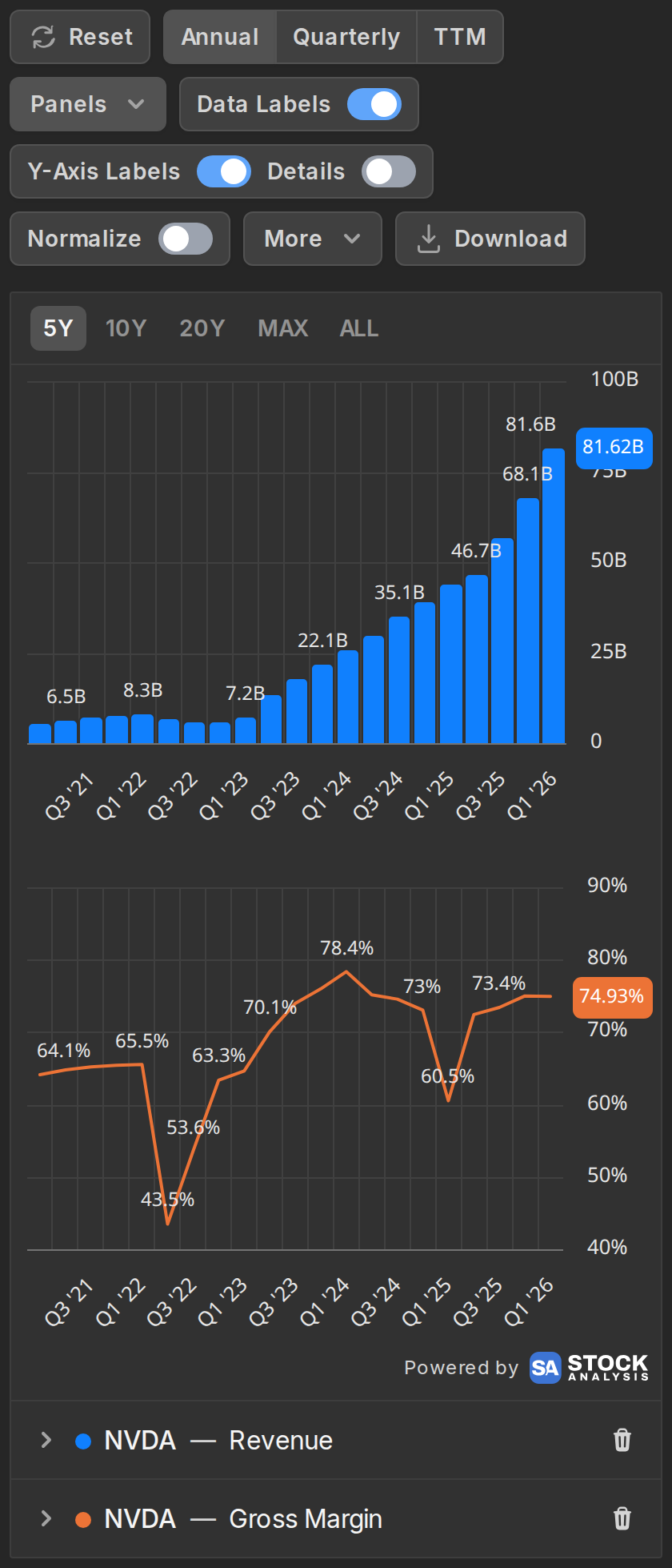
Split panels earn their keep when units don't mix. Dollars and percentages on one chart force two competing axes, but as separate panels each one gets scaling that makes sense on its own.
Percent change mode
The Normalize toggle rebases every series to 0% at the start of the visible window and draws everything as percentage change from there.
That makes head-to-head comparisons fair when the raw sizes are wildly different. Apple's market cap next to a smaller company's is a mountain next to a flat line. But when normalized, you can actually see which one grew faster.
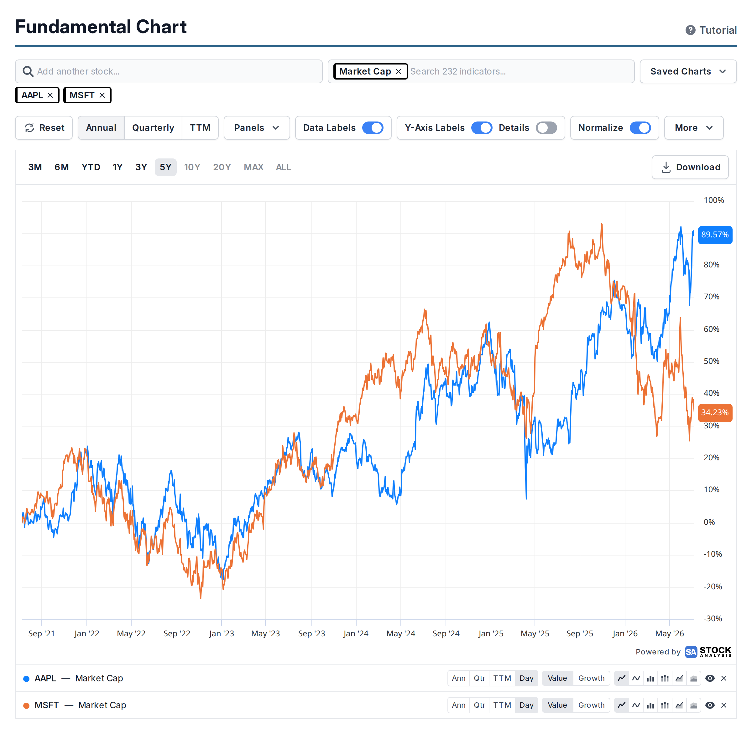
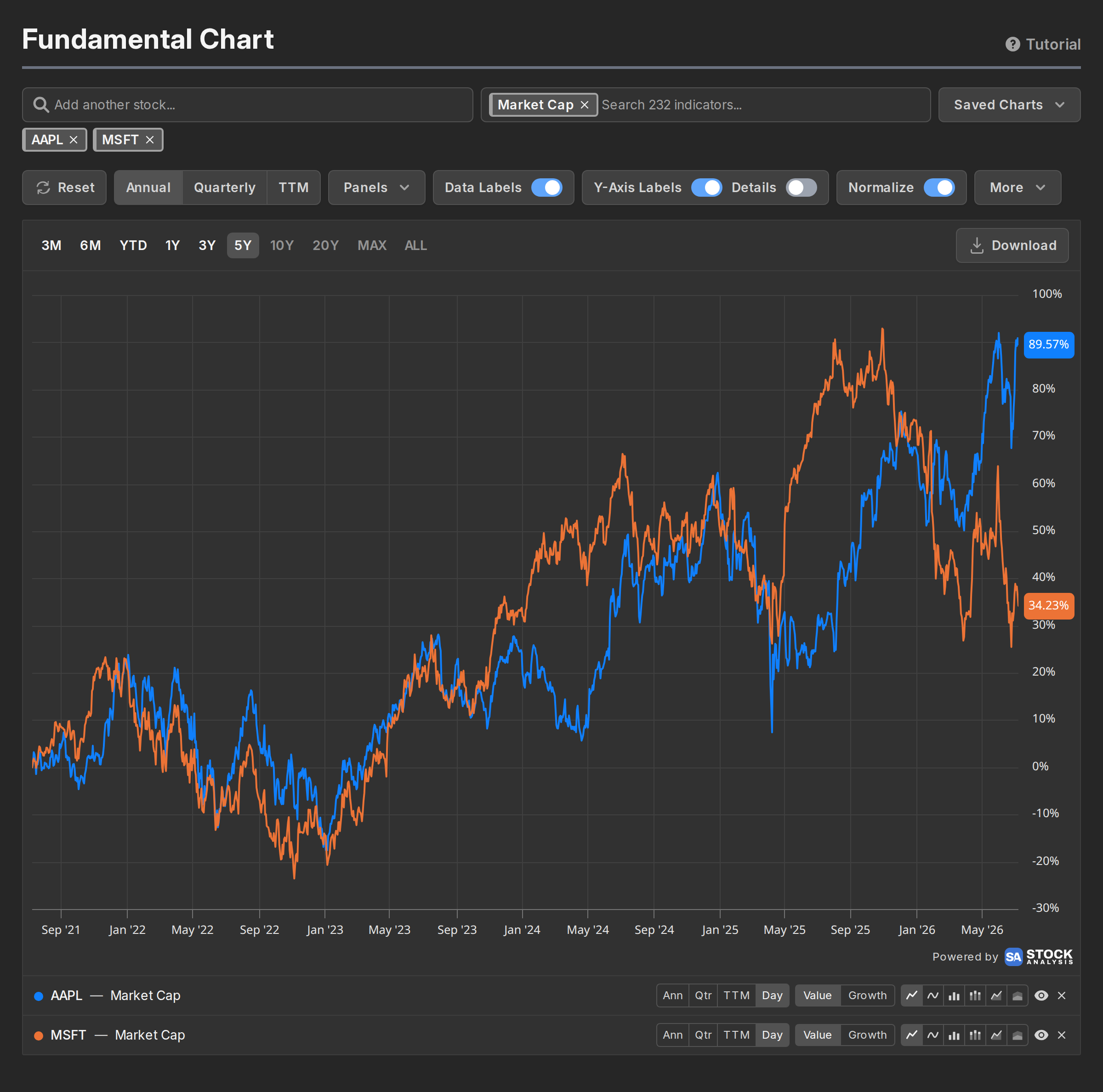
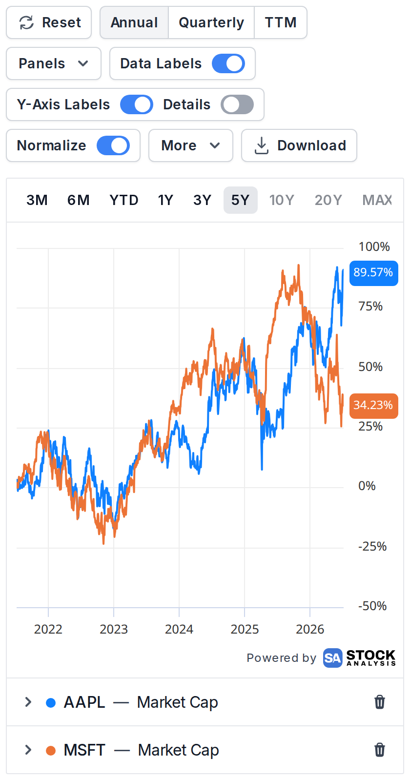
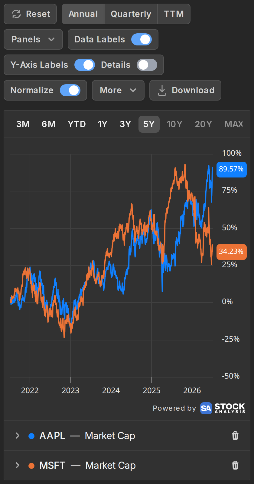
The starting point follows the window, so if you switch from 5Y to 1Y, everything re-anchors to 0% a year ago.
Mixed currencies
Plot a US company against one that reports in another currency and a currency selector appears in the controls bar. Pick a currency and every money-denominated series converts to it, so you're not comparing dollars to Canadian dollars by accident.
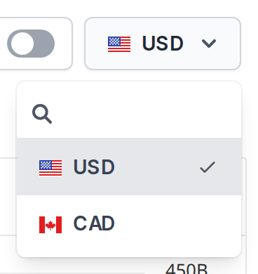
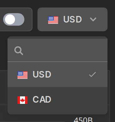
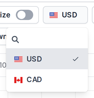
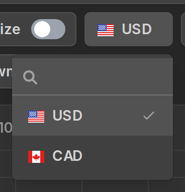
Ratios and percentages don't need converting and are left alone.
Labels and grid lines
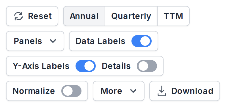
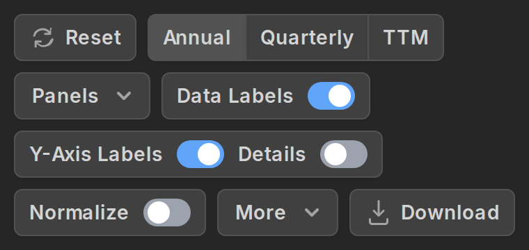
A few toggles in the controls bar change what gets drawn on top of the chart:
- Data Labels prints the value at every point. Great for a handful of annual bars, cluttered for dense daily lines, which is why each series row also has its own small label toggle.
- Y-Axis Labels are the value tags in the right gutter showing where each series currently stands. They're on by default, and the Details option underneath makes the label bigger and adds the stock symbol and/or the indicator to it.
- More holds the horizontal and vertical grid lines, if you prefer a cleaner canvas.


Forecasts and analyst data
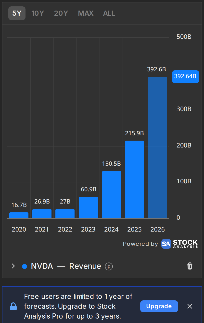
The indicator list has a Forecasted category with revenue, EPS, EBITDA, free cash flow and other metrics that carry Wall Street consensus estimates. Plot one and history and forecast are drawn as a single series, with the estimated part styled differently and a circular "F" badge on its row.
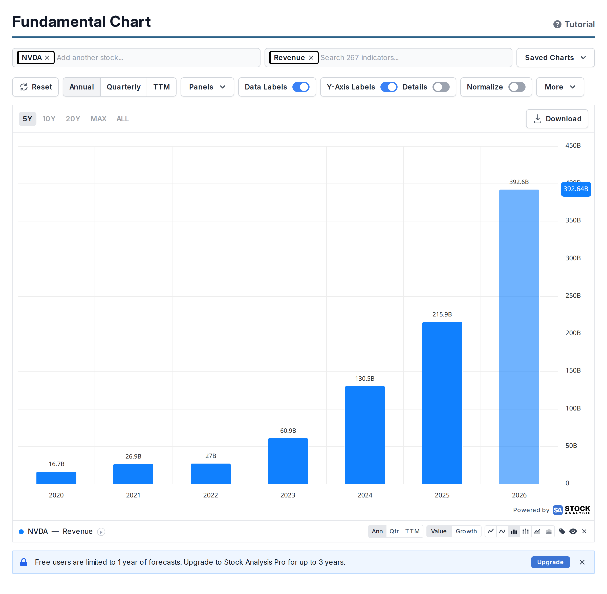
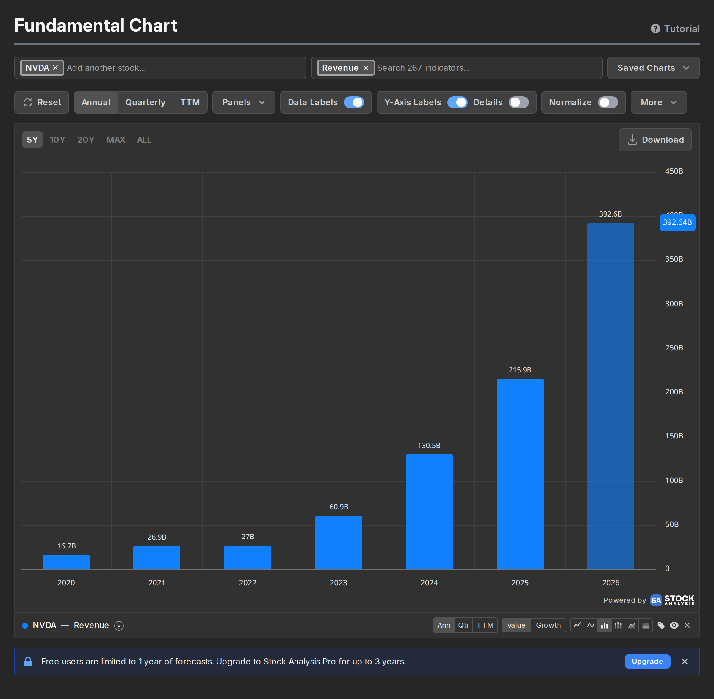
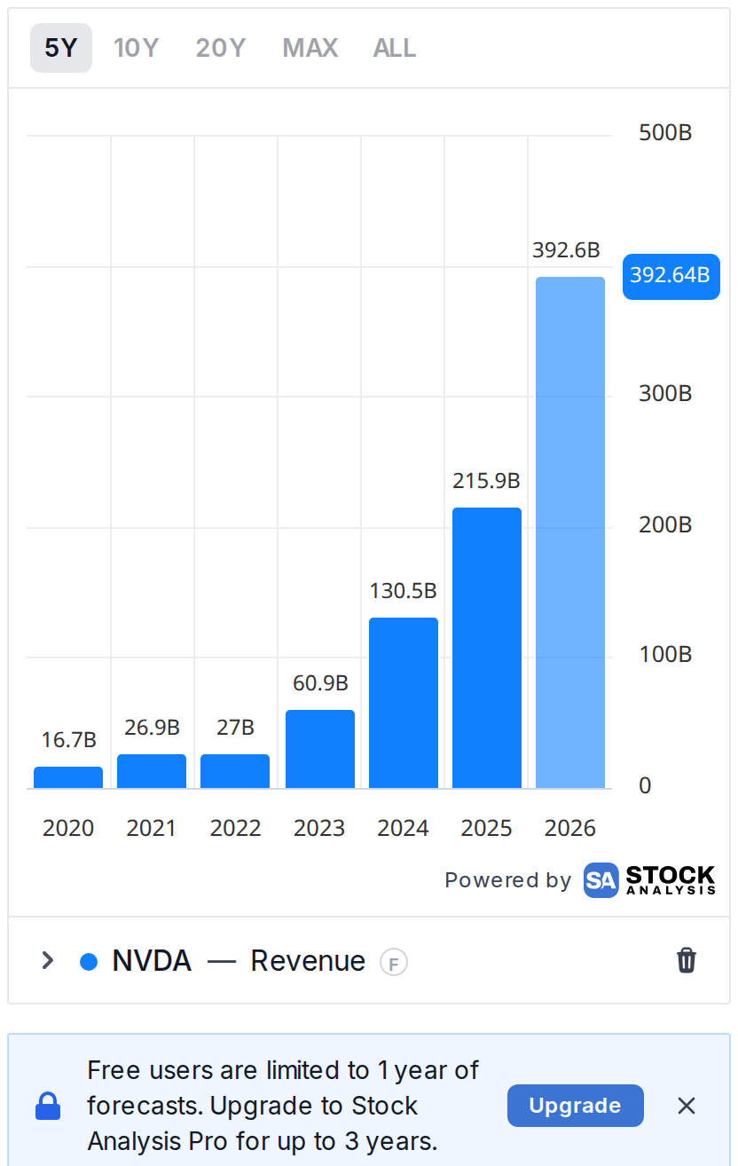
There's also an Analyst Ratings category with daily history for price targets and consensus ratings, so you can chart how the average price target moved against the actual price.
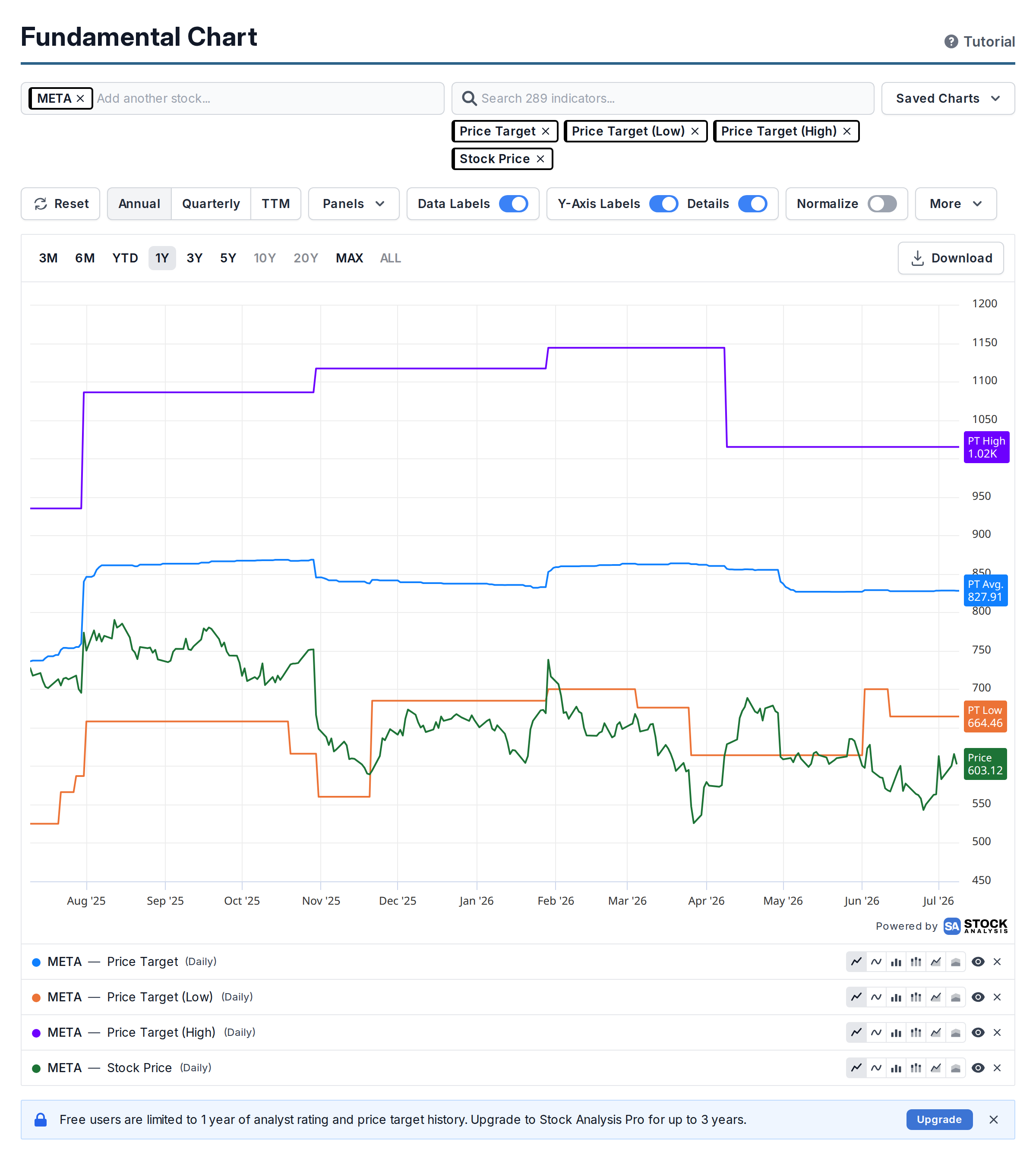
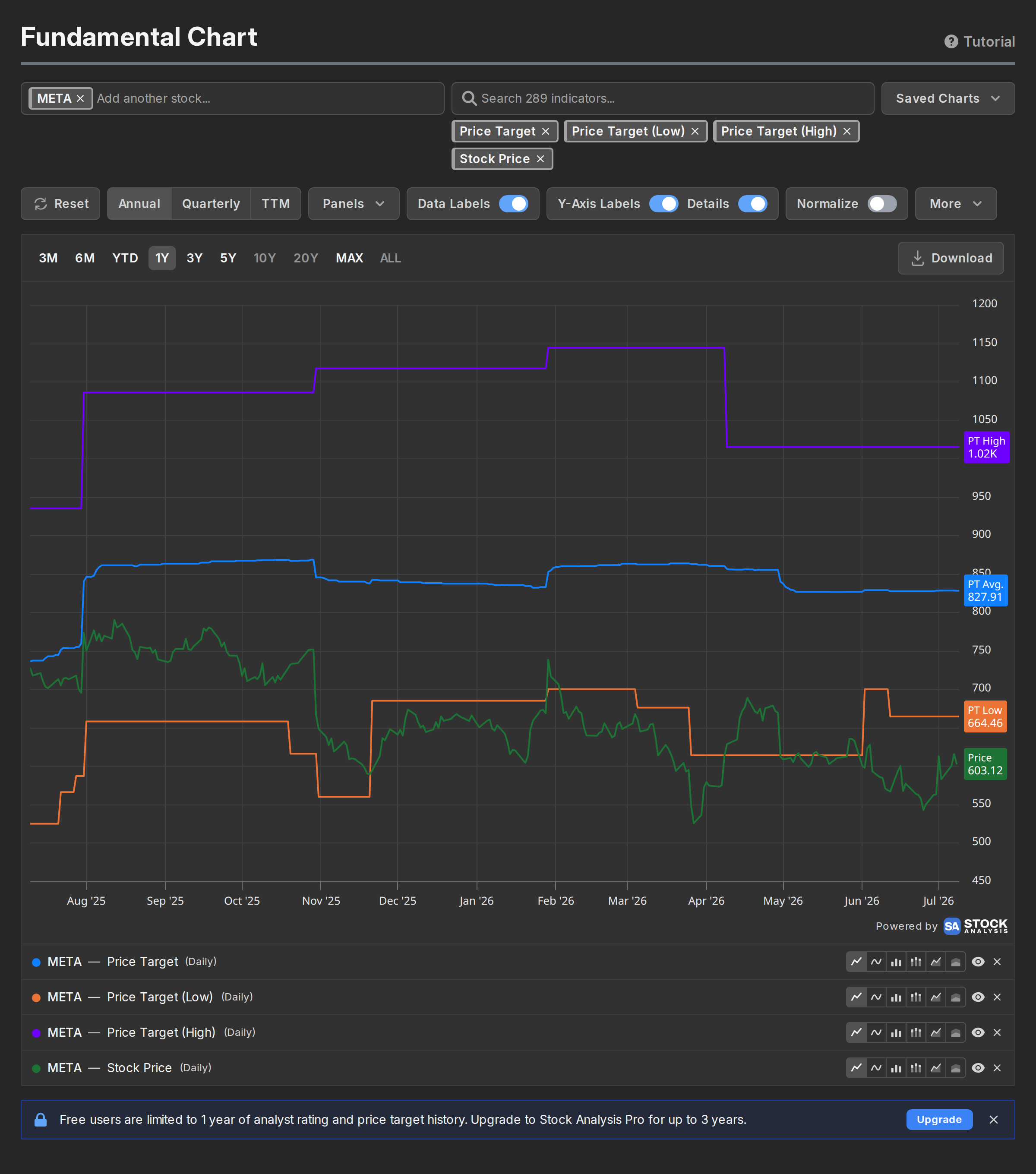
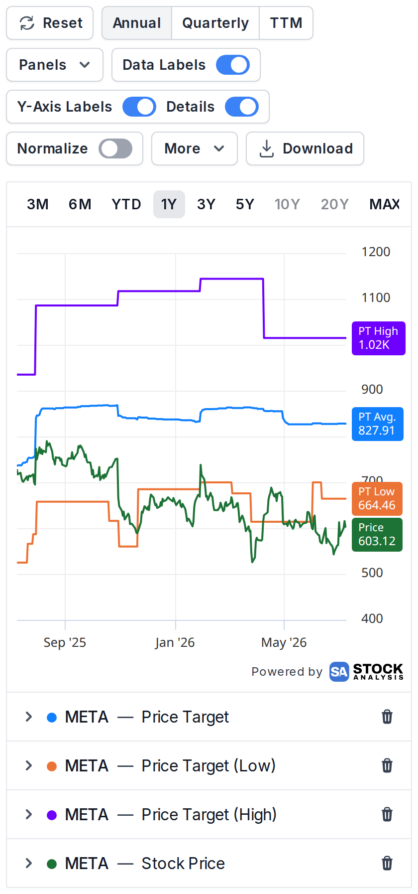
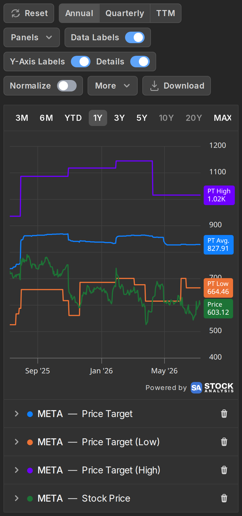
Free accounts see 1 year of forecasts, price targets and analyst history, Pro accounts up to 3 years. The chart tells you about this limit when it applies rather than silently cutting the data off.
Download the chart
The Download button sits in the top right corner of the chartwith the other controls above the chart. It opens an export dialog with a live preview of exactly what the file will look like.
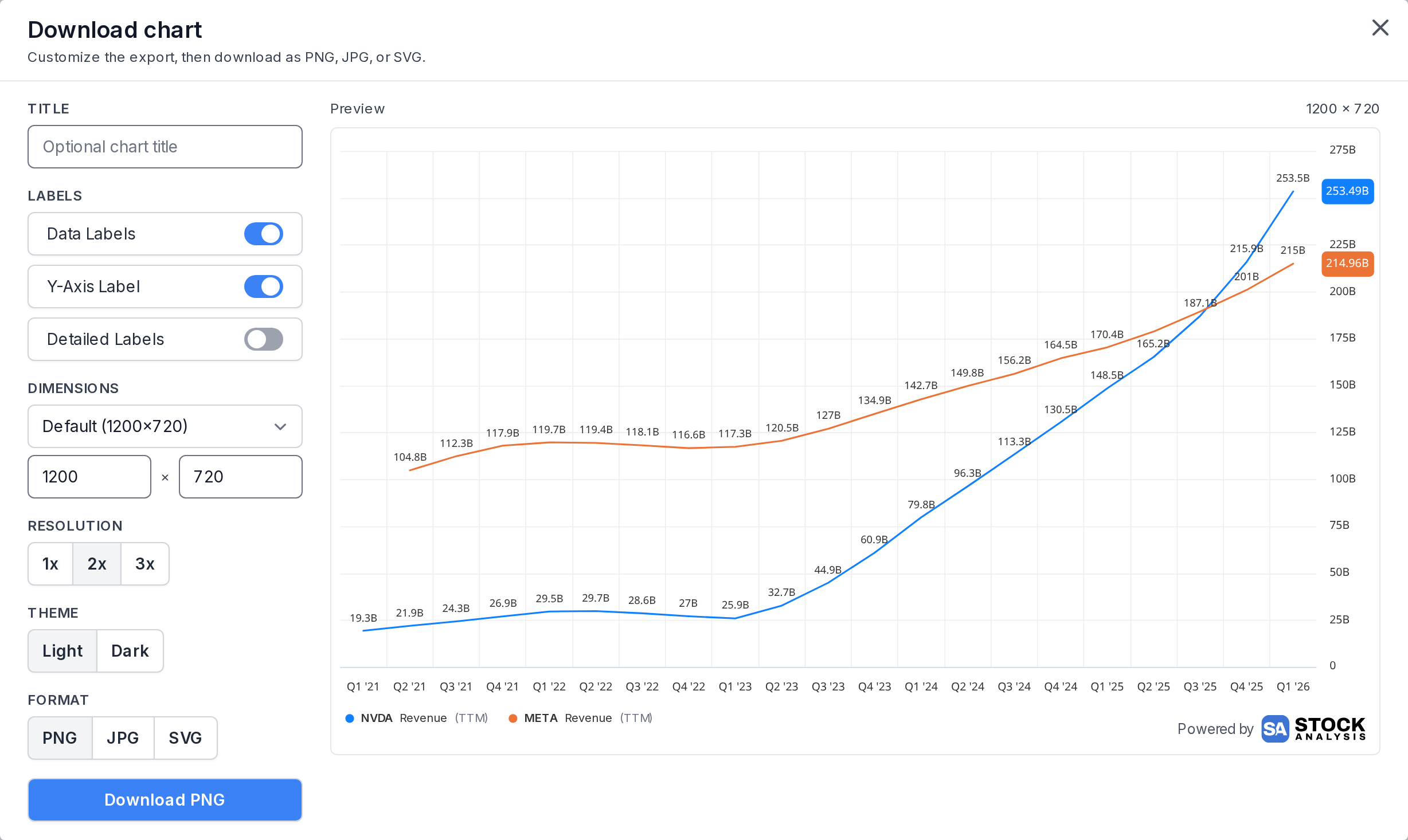
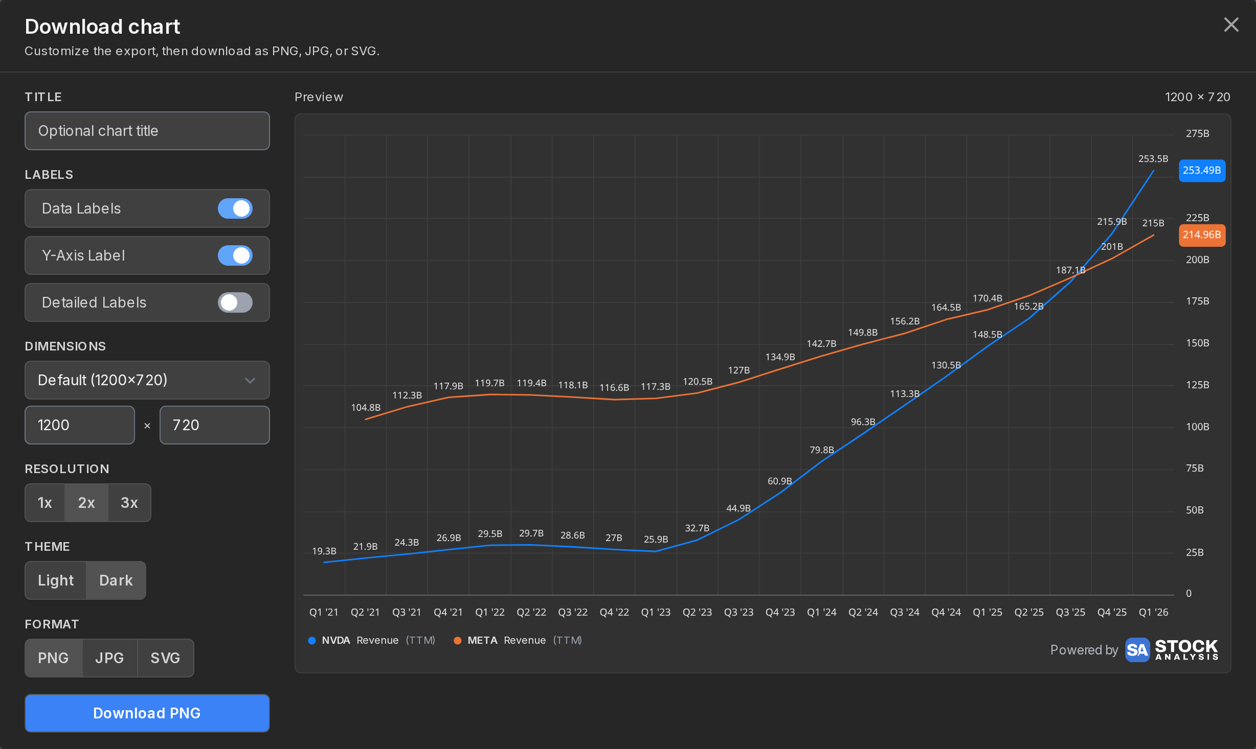
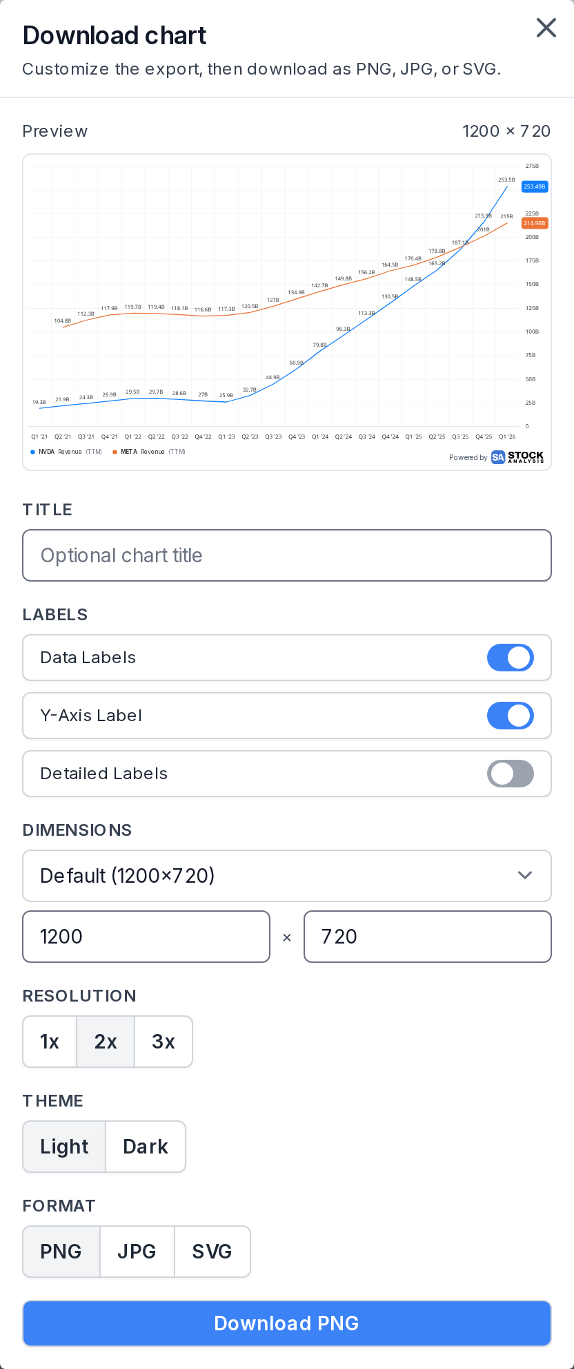
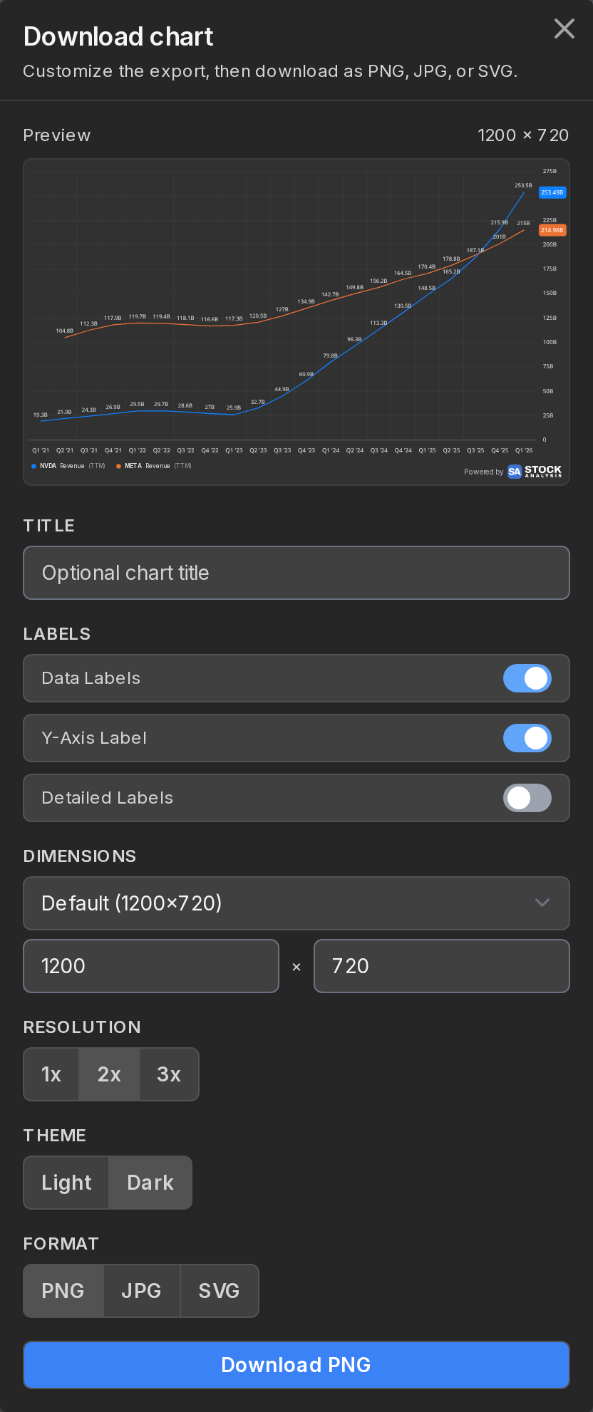
You can retitle the chart, add the company logo on single-company charts, toggle labels, and pick a size: the default 1200×720, wide 1920×1080 for presentations, 900×625 for social posts, square 1080×1080, or your own custom dimensions. Resolution goes up to 3x for crisp prints, the theme can be light or dark, and the format PNG, JPG or SVG.
Downloading charts is free for everyone.
Share a chart
Everything about your chart is stored in the page address: the companies, the indicators, the periods, the panel layout, all of it. Copy the URL from your browser and whoever opens it sees exactly the chart you built.
That also means bookmarks work as saved charts, and the browser back button walks through your recent chart states.
If you leave the page and come back later without a link, no harm done. The chart you had is remembered in your browser and restored.
Saved charts
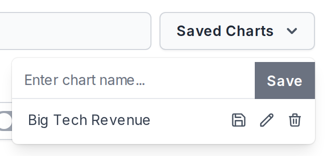
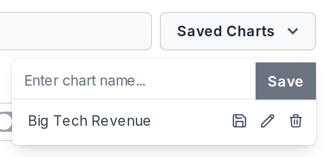
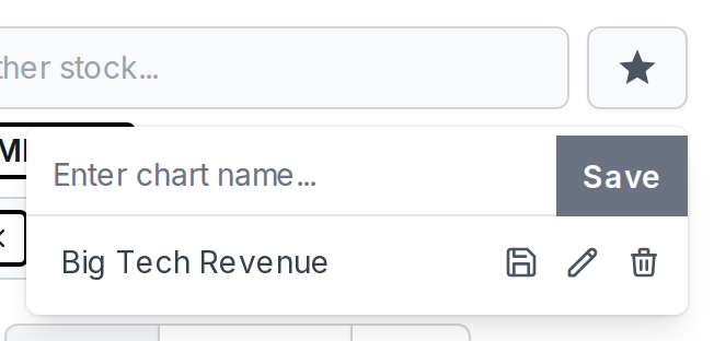
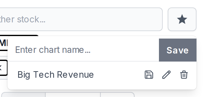
With Stock Analysis Pro, the Saved Charts dropdownstar button next to the search boxes keeps your regular setups one clicktap away.
Type a name, hit Save, and the chart joins the list. Apply one, tweak it, save it back under the same name, rename it, delete it, or drag the list into whatever order suits you. Saves follow your account, so they show up on your phone too.
Saved charts follow the company you're looking at. Say you saved a P/E chart while NVDA was selected. Apply it while Apple is selected and you get Apple's P/E. So to size up a stock, pick it once and click through your saved charts one by one.
There are two exceptions. With no ticker selected, a saved chart opens exactly as you saved it, original companies included. And a chart built on company-specific series like segment revenue always keeps its saved company, since that data doesn't exist for anyone else.
A few final tips
- Reset, on the far left of the controls bar, wipes the chart and starts you fresh. It clears the ticker and indicator pills too.
- The chart isn't just for US stocks. ETFs, non-US listings and mutual funds work too, though some indicators only exist for some symbols.
- Hover overTap and hold any point on the chart to read the exact values.
- On big monitors, Pro users can stretch the page with the full-width toggle next to the page title.
That's it. If an indicator you need is missing, or something looks off, let us know. We read every message.